
The payroll screen that answered its own questions.
Edenred's Salary Status screen drove 46% of salary-category support queries. Finance managers couldn't tell what stage payroll was at, why it stalled, or what to do next. I rebuilt it to answer all three, and salary-status queries fell around 21%.
Edenred's payroll status screen drove 46% of salary queries. I rebuilt it to answer stage, delays and next steps, cutting them ~21%.
The Salary Status screen was the single biggest driver of support queries, 46% of the salary category. It showed a stage was "in progress" but never what, why, or what to do.
Four fixes, all information not features: a clearer progress bar, contextual detail per step, explicit guidance when action is needed, and a flow personalised to each payroll type.
Four fixes, all information not features: a clearer progress bar, contextual detail, explicit guidance when action is needed, and a flow per payroll type.
Salary-status queries fell about 21% against the three months before launch, and about 16% year-on-year once normalised for 52% business growth.
A concept I explored
An AI assistant for the dead-ends.
A quick look at where I took this work next, then the full case study below. Even with a clear status screen, the dead-ends, a Central Bank rejection or a funds shortfall, can still leave the client stuck. This prototype explores an assistant that does not just explain the problem, it offers to fix it, with the client approving before any money moves.
Where I took this next. Even with a clear status screen, dead-ends like a Central Bank rejection can still leave clients stuck. This concept assistant doesn't just explain the problem, it offers to fix it, with approval before any money moves.
This is a self-initiated concept, not a feature Edenred shipped. Try it hands-on with Use the Prototype at the top, or watch the flow play out below.
A short walkthrough of the concept: the assistant spots the Central Bank rejection, corrects the four flagged records, and resubmits, confirming with the client before anything moves.
The assistant spots the Central Bank rejection, corrects the four flagged records and resubmits, confirming with the client before anything moves.
01 · The problem
A status screen that never said status.
Edenred's members are finance managers and HR admins running payroll for mid-to-large UAE companies. Payroll day is high-stakes and time-pressured, and the one screen meant to reassure them did the opposite. It showed that something was happening, but never gave them the confidence that things were actually moving.
Edenred's members run payroll for UAE firms on a high-stakes day. The screen meant to reassure them did the opposite, showing activity but never real progress.
Reviewing the support logs, the confusion sorted into three recurring frustrations:
- Users couldn't tell what stage payroll was actually at
- When a run was delayed or rejected, there was no explanation and no next step
- The interface was identical for every payroll type (WPS Card, Non-WPS Card, WPS Bank, Non-WPS Bank) despite very different compliance processes
"Customers did not get all the necessary information on the portal, hence they were forced to call the CS team in times of any issue."
02 · Approach
The calls were the research.
I walked the live flow as an end-user would, ran a structured workshop with eight people from the Customer Success team, and read three months of query logs. Categorised, almost every query collapsed into one of three questions:
I walked the flow, ran a workshop with eight from Customer Success, and read three months of logs. Nearly every query was one of three questions:
- "Where is my payroll?"
- "Why is it delayed?"
- "What do I need to do next?"
The insight that shaped everything: all three were self-service questions. The product already held the answers; the design simply wasn't surfacing them. So the brief wasn't "add features", it was "answer the three questions, in context, at the right moment".
All three were self-service questions: the product held the answers, the design wasn't surfacing them. Not "add features" but "answer them, in context".
03 · The solutions
Four fixes. All information, not features.
Each question from the logs became a design job. Here is the before and after for each.
A clearer progress bar
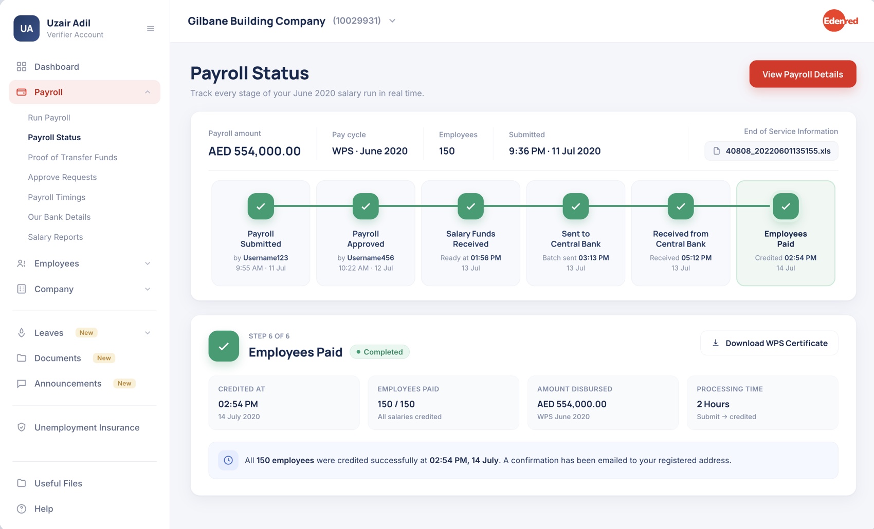
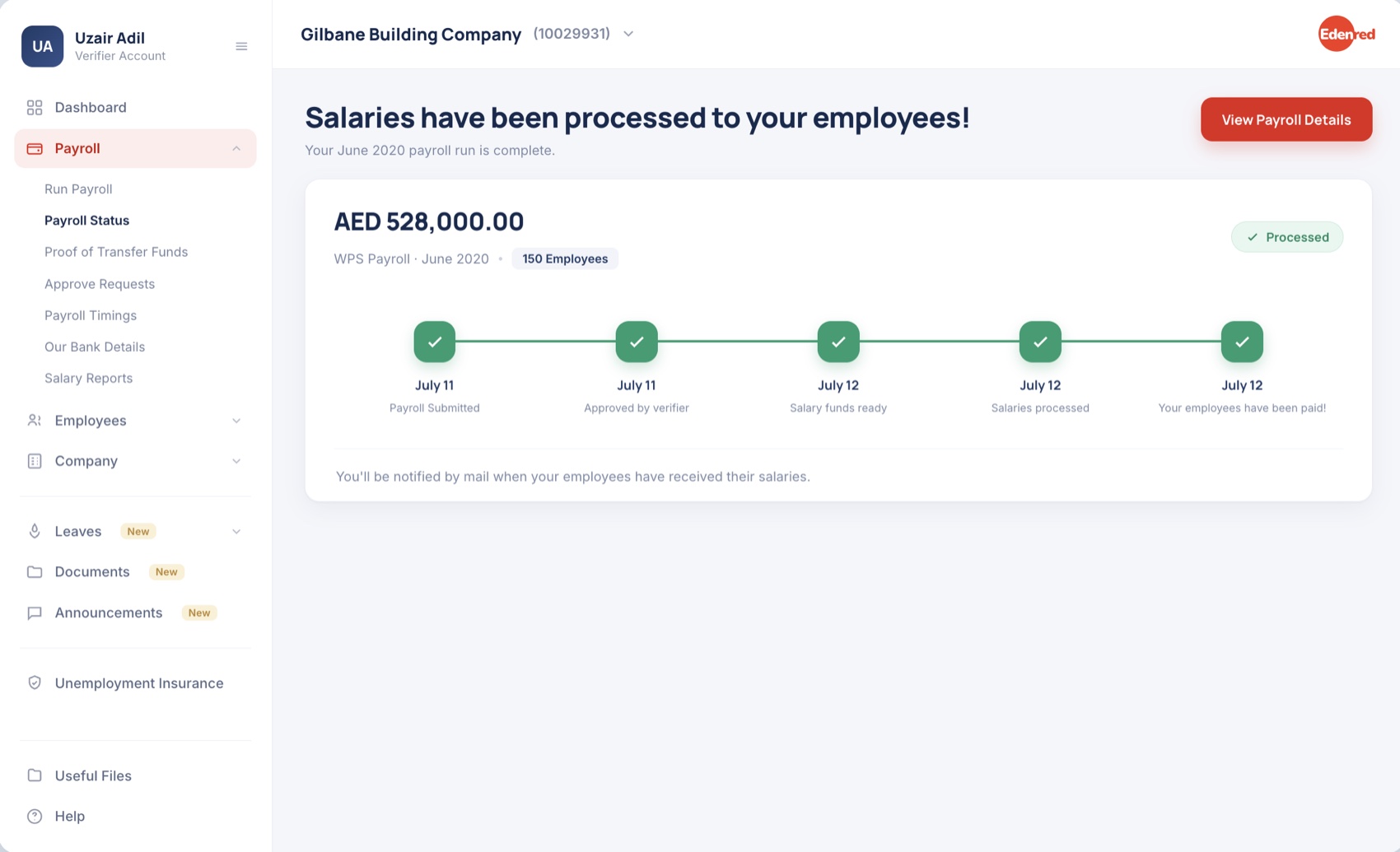
I renamed and reordered the stages to match the real backend sequence, and put a timestamp and a responsible name on each one. "Where is my payroll?" now has a precise, glanceable answer.
Stages reordered to match the backend sequence, each with a timestamp and owner. "Where is my payroll?" now has a glanceable answer.
Contextual information per step
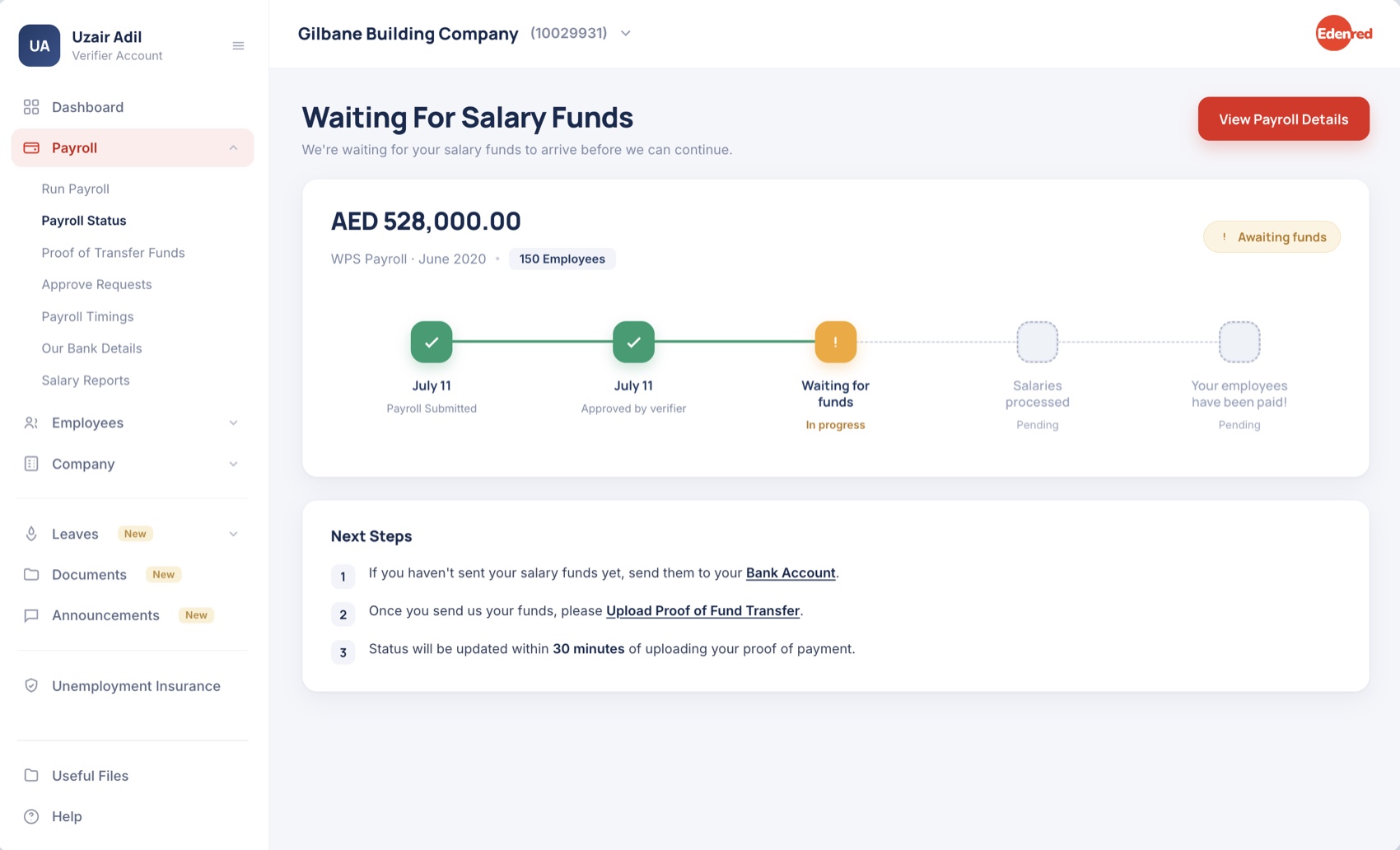
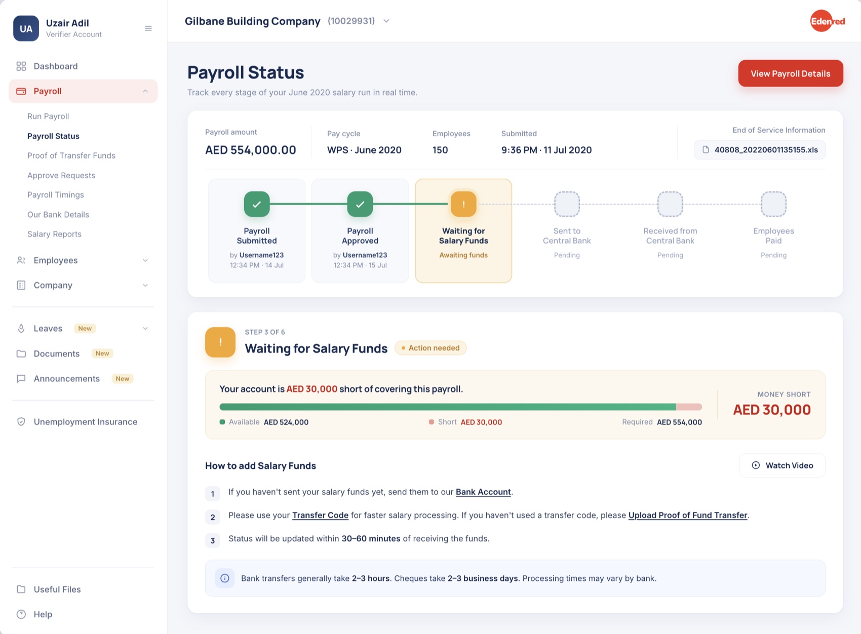
Every stage now carries its own status and a plain-language explanation. A "waiting for funds" step spells out exactly how much is short and how to fix it, with a short video. "Why is it delayed?" answers itself.
Every stage carries its own status and plain explanation. A "waiting for funds" step shows the shortfall and the fix, answering "Why is it delayed?".
Guidance when action is required
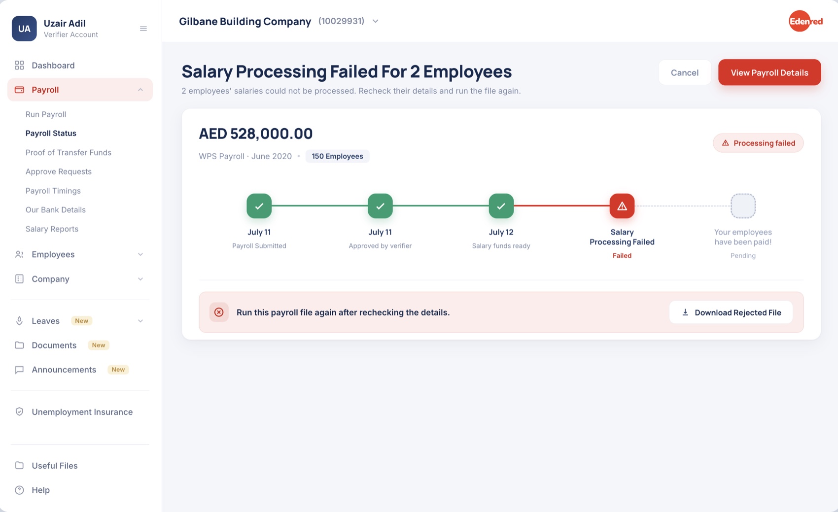
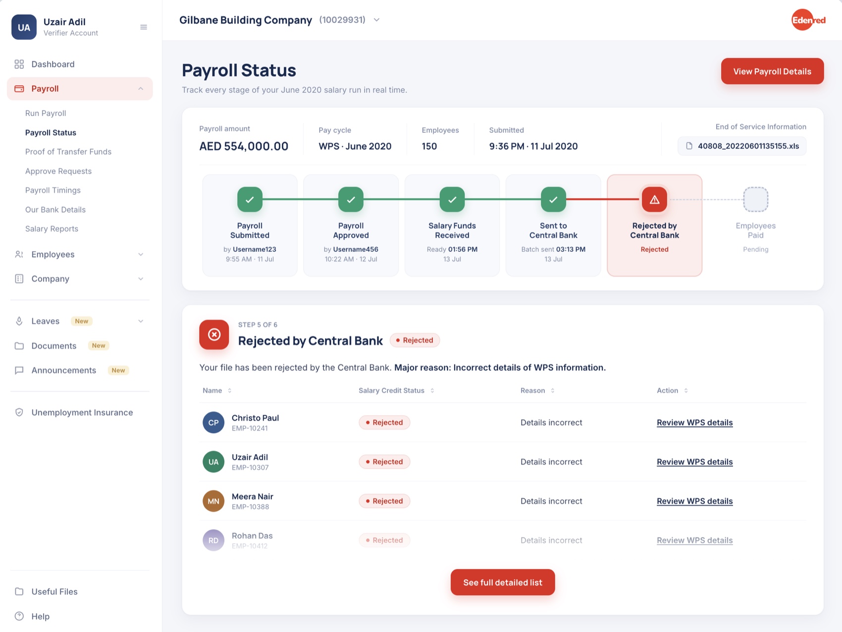
When the client has to act, the screen says so, explicitly, and lists exactly who and what. A central-bank rejection now names each affected employee and links straight to the fix. "What do I need to do next?" becomes a checklist.
When action is needed, the screen says so and lists who and what. A rejection names each affected employee and links to the fix, making "What next?" a checklist.
Personalised by payroll type
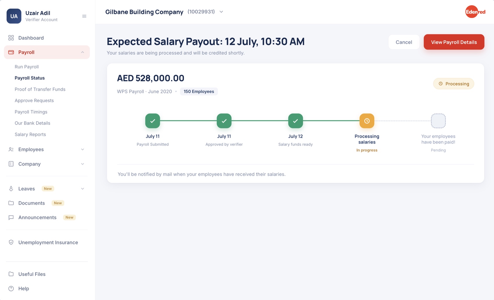
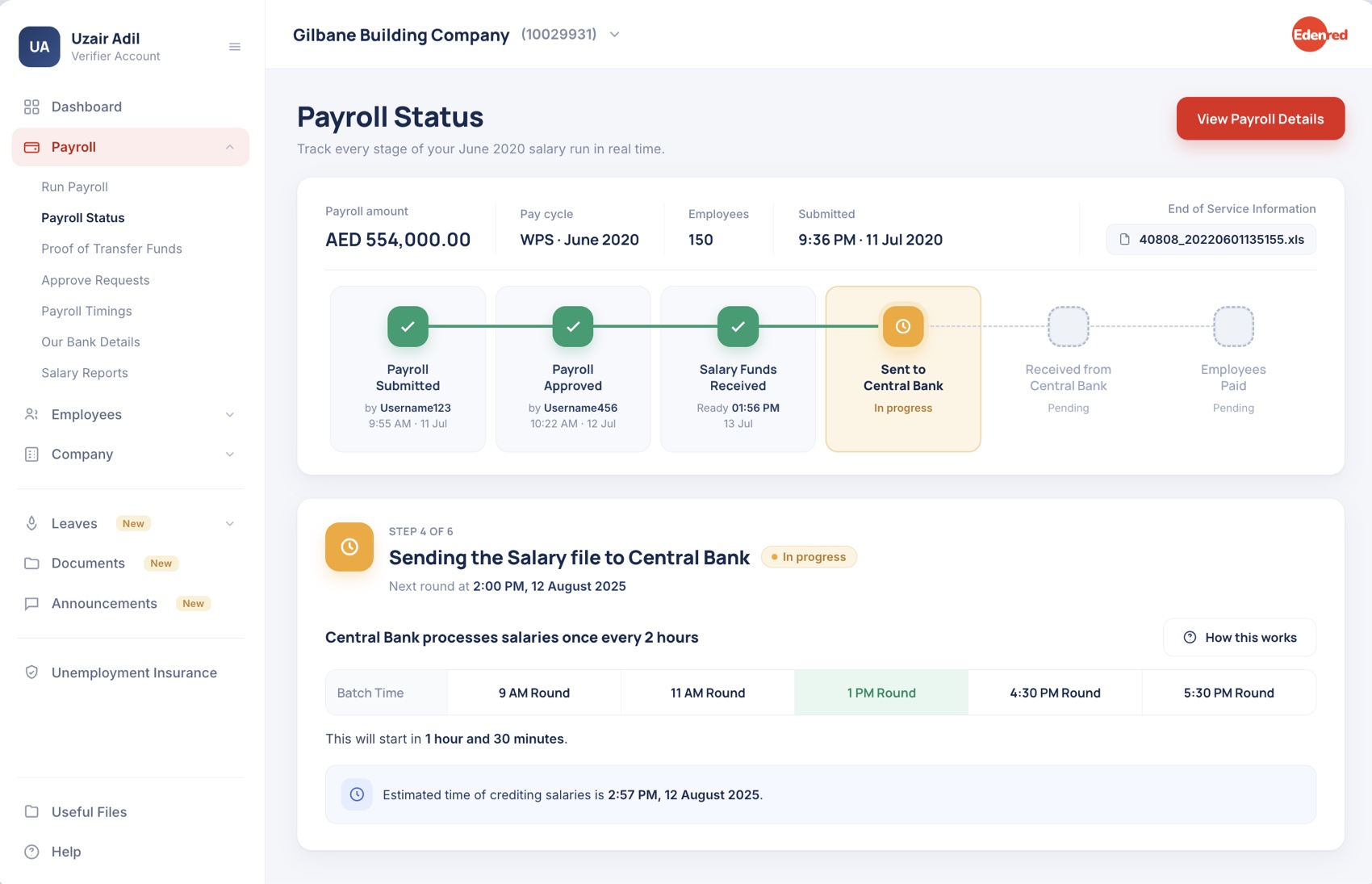
The flow adapts to the route. WPS and Non-WPS, Card and Bank each have different compliance stages, so the screen shows only the ones that apply. A WPS run surfaces live Central-Bank batch timings and an ETA; other types never see them.
The flow adapts to the route: each payroll type shows only the compliance stages that apply, adding live Central-Bank timings and an ETA for WPS runs.
"Your primary CTA is red, but red also signals danger. Doesn't that collide?" Edenred's brand is red, and on a revenue-critical B2B portal with a slow-changing audience, walking away from the brand color would cost more trust than it buys. So the system separates the two jobs structurally, not by hue: primary actions are solid, rounded, label-led buttons; failures pair a muted red tint with an icon, a heading and an inline explanation; waiting states are amber. Meaning is never carried by color alone, which is also the accessible answer: a colorblind user reads the exact same states. We watch support logs and usability sessions for confusion signals; none so far, and if they appear, that is the trigger to revisit.
"Red CTA, red danger, don't they collide?" The brand is red, so meaning comes from structure, not color alone.
04 · Riskiest assumptions
Three bets, tested before I shipped.
The redesign leaned on three assumptions that could have sunk it. I prototyped and tested each with real clients first, rather than finding out in production.
Guidance videos would just be ignored.
Tested the prototype with five clients, watching whether they reached for the video CTAs.
4 of 5 clicked the videos. Shipped the pattern with confidence.
Showing "completed by [name] at [time]" would feel invasive.
Three finance managers reviewed the attributed prototype and talked through how it felt.
All read it as reassurance, not surveillance. Kept the attribution.
Diverging WPS and Non-WPS flows would feel inconsistent.
Two clients who run both payroll types walked through the two distinct flows side by side.
The split matched their mental model and felt clearer, not messier.
05 · The data
Why I measured the rate, not the count.
Raw query volume actually went up after launch. On its own, that reads like failure. It isn't: the business grew about 52% year-on-year, so more payrolls naturally means more queries. The only honest metric is queries per 100 payrolls processed, which strips out growth and shows whether the design really reduced friction.
Raw volume rose after launch, looking like failure. But growth was ~52%, so more payrolls mean more queries. Honest metric: queries per 100 payrolls.
| Period | Month | Salary-status queries | Payrolls processed | Query rate (per 100) | Notes |
|---|---|---|---|---|---|
| Jul–Sep '24 (pre) | Jul '24 | 372 | 2,605 | 14.3 | Pre-redesign · summer dip |
| Aug '24 | 417 | 2,754 | 15.2 | Pre-redesign · baseline | |
| Sep '24 | 349 | 2,501 | 14.0 | Pre-redesign · stable | |
| Jul–Sep '25 (post) | Jul '25 * | 503 | 4,103 | 12.3 | Post-redesign · partial month |
| Aug '25 | 480 | 4,006 | 12.0 | Post-redesign | |
| Sep '25 | 461 | 3,802 | 12.1 | Post-redesign |
| Metric | Pre (avg) | Post (avg) | Change | Read |
|---|---|---|---|---|
| Avg monthly queries | 379.3 | 481.3 | +26.9% | Raw volume up: the business grew |
| Avg payrolls processed | 2,616.7 | 3,966.7 | +51.6% | Roughly 52% growth year-on-year |
| Avg query rate (per 100) | 14.5 | 12.13 | −16.3% | The number that mattered fell |
Redesign launched end of Jun '25 · Jul '25 is a partial month · query rate = queries per 100 payrolls processed. This is directional evidence, not a controlled experiment.
Judged on raw count, the redesign looks like it added queries. Judged on the growth-adjusted rate, it removed friction: queries per 100 payrolls dropped about 16% year-on-year, and about 21% against the three months right before launch. Same product, opposite conclusions. Picking the honest metric was half the work.
Raw count says more queries; growth-adjusted, less friction, down ~16% YoY. Same product, opposite reads.
06 · Impact
Fewer "I don't know what's happening" calls.
The qualitative shift mattered as much as the number: far fewer "I don't know what's happening" calls, and the queries that did come in were specific and informed. Payroll volumes swing with business and seasonal cycles, so the team keeps monitoring across consecutive months before drawing a final conclusion.
The qualitative shift mattered too: far fewer "what's happening?" calls, and those that came were specific and informed. Monitoring continues.
Every query in the logs, "Where is my payroll?", "Why is it delayed?", "What do I need to do next?", was a question the product could already answer. The screen wasn't broken, it just wasn't saying anything. The whole redesign added almost no new features, only the information that was already there, shown at the right moment.
Every logged query was one the product could already answer. The screen wasn't broken, it just wasn't saying anything.